Why Paper Brightness Matters in Marketing
When designing brochures, business cards, catalogs, or direct-mail pieces, marketers often focus on layout, imagery and copy — but paper brightness quietly plays a huge role in the final outcome. Brightness affects perceived color vibrancy, contrast, readability and even the emotional signal your brand sends to customers. This article breaks down what paper brightness is, why it matters, and how to choose the right level for your marketing materials.
What is paper brightness?
Paper brightness is a measure of how much light a sheet of paper reflects; technically it’s measured under a specific blue light (ISO brightness scale). Higher brightness numbers mean the paper looks whiter and reflects more light. Important: brightness is different from whiteness (which measures degree of white appearance under different lights) and from opacity (how much show-through occurs).
How brightness affects color reproduction
Bright papers reflect more light back through printed inks, which makes colors appear more vivid and saturated. On low-brightness stock, colors can look muddier or flatter because the paper absorbs more light and decreases apparent contrast. For photographic prints, catalogs, and any asset where color impact matters, a higher brightness often yields better-looking results.
Readability and contrast
Text contrast depends on the difference between ink and paper. High-brightness stock increases contrast with darker inks — improving legibility for small type and dense content. If your marketing piece uses lots of fine print (terms, ingredients, disclaimers), higher brightness can keep text clear without needing heavier ink weights.
Perceived quality and brand perception
Humans use visual cues to judge quality. Bright, clean paper signals care, professionalism and premium positioning. Conversely, dull or yellowish stock can unconsciously make a design feel cheaper or dated — even if the layout and copy are strong. Choosing the right paper brightness is an inexpensive way to elevate a brand’s physical presence.
Photography and skin tones
For marketing that features people, brightness influences how skin tones render. Very bright, cool-toned papers can make images look crisp but may shift some skin tones slightly cool; warmer or mid-brightness stocks may be more forgiving for certain palettes. Always proof images on the actual stock when possible.
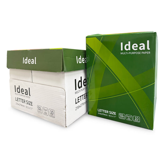
Practical brightness ranges for marketing pieces
- 70–80 brightness: Good for internal docs, flyers, and some mass mailers; economical and functional.
- 80–90 brightness: The sweet spot for most brochures and multipage catalogs — balanced color and cost.
- 90–100 brightness: Premium brochures, high-end packaging, photography-heavy catalogs — exceptional color pop and perceived quality.
Other paper properties to consider
Brightness isn’t the only variable. Consider:
- GSM (weight): Heavier stock feels more substantial.
- Finish: Matte vs gloss affects sheen and perceived saturation.
- Coating: Coated papers (silk, glossy) enhance color; uncoated papers feel more tactile and natural.
- Opacity: Avoid low opacity for double-sided prints to prevent show-through.
Proofing: the single most important step
Never trust screen-only previews. Paper and printer interact in ways screens can’t predict. Order printed proofs on the actual stock, check colors under typical lighting, and confirm how text and images render. Small adjustments to color profiles or ink density can produce large improvements once you’ve seen the proof.
Cost vs impact: a marketer’s decision
Higher-brightness stocks cost more, but the ROI often shows in stronger engagement — better perceived quality, higher response rates to direct mail, and fewer customer complaints about print quality. Weigh the incremental cost against the marketing objective: a premium brochure intended to convert high-value customers often warrants a brighter, heavier stock.
Tip: For mixed campaigns, consider using higher-brightness stock for the primary touchpoint (brochure, booklet) and lower-cost stock for inserts or bulk mailers.
Quick checklist before ordering print
- Do a printed proof on the chosen stock.
- Confirm brightness, GSM, finish and opacity with your printer.
- Check images and skin tones in real light conditions.
- Decide where to invest: cover stock vs internal pages vs inserts.
FAQ
- Is brighter always better?
- No — very bright stock may feel clinical for some brands. Match brightness to brand personality and use-case.
- Does brightness affect recyclability?
- Brightness is a surface property; most bright papers are recyclable. Check for coatings or laminates which can affect recyclability.
- How do I measure brightness?
- Brightness is measured under standardized lab conditions (ISO brightness). Your supplier should provide the number on spec sheets.